Jetpack Compose – basics & quick tutorial
What is Jetpack Compose?
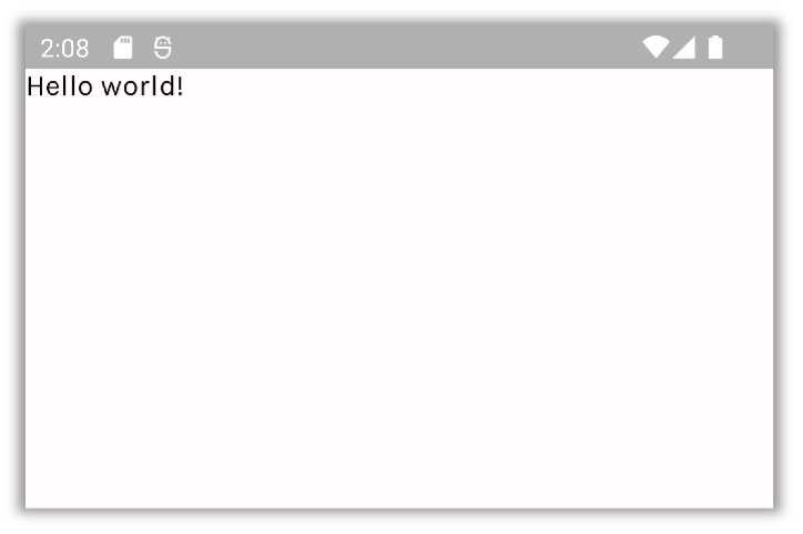
Jetpack Compose is a modern toolkit for building native Android UI. Compose is built around composable functions, created using Kotlin APIs. These functions let you define your app’s UI programmatically. To create a composable function you just need to add @Composable annotation.
Development environment
To use Jetpack Compose make sure that you have the newest Android Studio available (currently Bumblebee 2021.1.1).
How to create a new Compose project?
- In Android Studio, choose File > New > New project.
- Choose Empty Compose Activity and click Next.
- Fill application info – make sure that Kotlin language and API level 21 or higher are selected .
- Click Finish.
Tooling
As Jetpack Compose doesn’t rely on View to render its composables, Android Studio offers extended features, allowing developers to preview their UI without using a device or emulator.
To enable a preview of a composable, you need to create another composable and mark it with both @Composable and @Preview annotations.
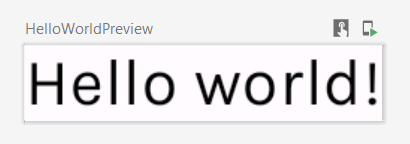
You can customize the way your preview is rendered, by providing parameter values to @Preview annotation.
Additionally, Android Studio allows you to view your composable in interactive mode, by clicking on the Start interactive mode, above the preview. You can also deploy your preview directly to your device.
Android Studio also allows you to analyze your animations using Animation Preview tool and your layouts, using Layout Inspector.
To learn more check out Google’s setup tutorial: https://developer.android.com/jetpack/compose/setup.
Thinking in Compose
The old XML views forced the developer to manipulate views manually, using functions like findViewById(). This highly increased the likelihood of errors. Lately, the whole industry has been shifting to declarative UI models (Flutter, React, etc.). Compose is also a declarative UI framework.
A simple composable function must follow some rules. The most important of them are:
- The function must be annotated with @Composable annotation.
- The function can take in data. Composable functions can accept parameters, which describe the UI and provide a way to handle UI events.
- The function doesn’t return anything – it emits UI hierarchy, by calling other composable functions.
- Most importantly, the function is fast, idempotent, and free of side-effects
- The function behaves the same way when called multiple times with the same argument (e.g., doesn’t use global variables or calls to random())
- The function doesn’t modify properties or global variables.
The composable functions are responsible for transforming the current application state into a UI every time the observable data updates. It is done by taking in data and passing it to other composables down the hierarchy.
When the user interacts with the UI, the UI raises events (e.g., onClick). Those events should notify the app logic, which can then change the app’s state. State changes trigger a process called recomposition, which redraws necessary UI elements.
Recomposing the entire UI tree can be computationally expensive. To solve this problem, Compose uses intelligent recomposition. When Compose recomposes based on new inputs, it only calls the functions or lambdas that might have changed and skips the rest. This leads to several things that the developer must be aware of:
- Composable functions can execute in any order.
- Composable functions can execute in parallel.
- Recomposition skips as many composable functions and lambdas as possible.
- Recomposition is optimistic and may be canceled.
- A composable function might be run quite frequently, as often as every frame of an animation.
To learn more check out Google’s Thinking in Compose article: https://developer.android.com/jetpack/compose/mental-model.
Compose basic examples
Let’s look at some of the most popular composables. The following examples use composables provided by the Compose UI library, as well as the new Compose Material 3 (currently in alpha, but old Material library can also be used). The examples have also a theme applied – to learn more about how to create and apply themes, check out Google’s Jetpack Compose theming codelab: https://developer.android.com/codelabs/jetpack-compose-theming.
Layouts
There are three basic layout elements in Compose – Column, Row and Box. They take Composable content, so you can place elements inside them.
A simple composable that uses Column could look like this:
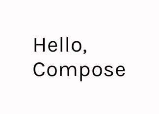
The Greeting composable takes in the name parameter, with default value set to „Compose“. It displays texts in a vertical manner and uses Modifier object to apply padding.
Surface
Let’s try to apply a different background color to the Greeting composable. This can be done by wrapping the composable with a Surface. Surface is a Material Design concept; you can read more about it in the Material Design documentation: https://material.io/design/environment/surfaces.html.

To set a color, we used MaterialTheme object. It allows us to access the current theme values, according to Material Design 3/Material Design 2 color scheme.
Card
An easy way to style an elevated component is by using Card composables. Compose Material 3 library provides three types of cards, that you can use in your app – in this example we will use ElevatedCard.

ElevatedCard replaced the Surface component. To make the card take full width, an additional fillMaxWidth modifier was applied. The name was also styled by applying a style from Material Design 3 typography.
RecyclerView made easier – LazyColumn
There is a lot of boilerplate code needed to create a scrollable list using regular Views. You need to create additional layouts, ViewHolder, Adapter etc. Compose allows you to create a list easily – using LazyColumn Composable.
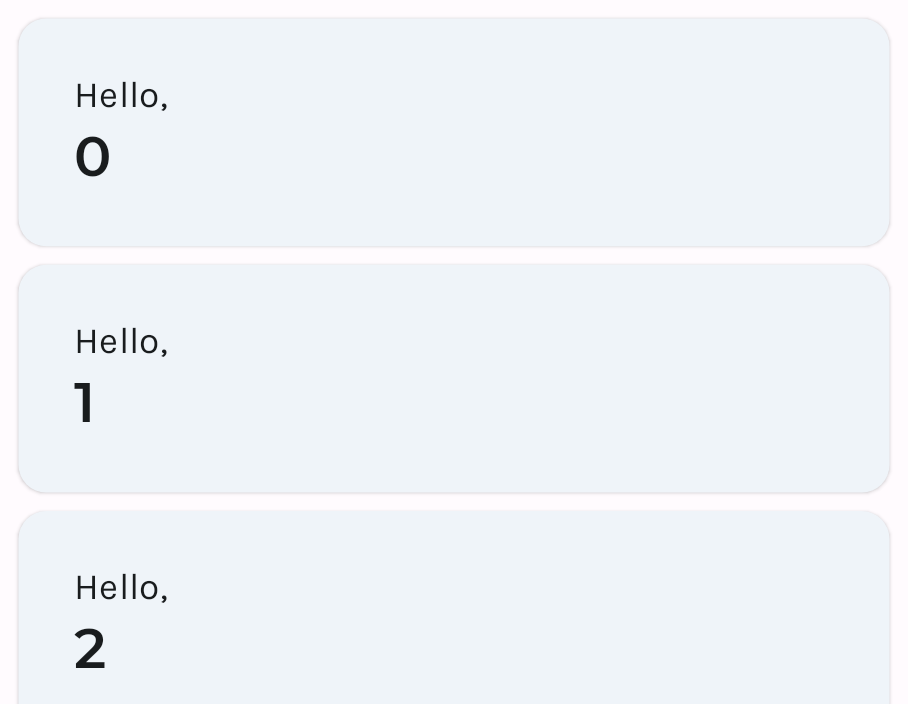
LazyColumn allows you to display a scrollable column. It renders only visible items on screen, which allows for a performance gain. Instead of recycling its children like RecyclerView, it emits new composables.
Summary
There is much, much more to Jetpack Compose than issues mentioned in this article. Google provided developers with extensive documentation, as well as codelabs, which can help to learn Compose quickly and easily. You can access the codelabs, code sample, and documentation using the links below:
- Jetpack Compose course: https://developer.android.com/courses/pathways/compose
- Jetpack Compose documentation: https://developer.android.com/jetpack/compose/documentation
- Material Design 2 documentation: https://material.io/
- Material Design 3 documentation: https://m3.material.io/
- Compose samples: https://github.com/android/compose-samples
Note
This article was created using Compose UI library version 1.1.1 and Compose Material 3 library version 1.0.0-alpha10.
Join Mobile Team
Isn't it great?


